Health Scores
What are Health Scores?
A Health Score is a single 0-100 number that summarises how healthy each account is. Instead of juggling multiple metrics in your head, you define what “healthy” means for your business once, and Strand calculates a composite score for every account automatically.
You choose the inputs (usage, engagement, support load — whatever matters), set thresholds for what “good” and “poor” look like, assign weights, and the score is kept up to date as your data changes.
Health Scores are most useful for:
- Spotting at-risk accounts at a glance in the Accounts table.
- Giving your team a shared definition of account health.
- Tracking whether an account is trending up or down over time.
Core Concepts
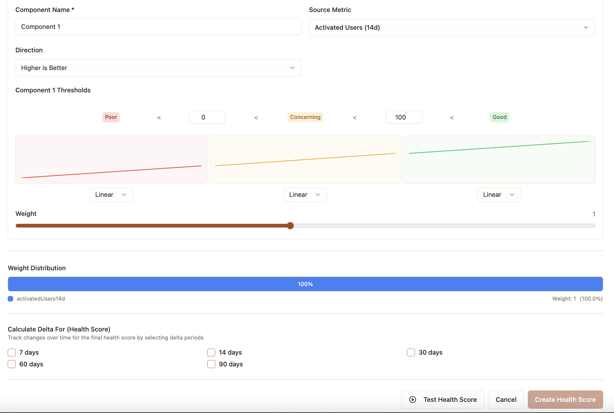
Components
A Health Score is built from one or more components. Each component points to a numeric field that already exists on your accounts (for example loginCount30d, openTickets, or daysSinceLastLogin).
For each component you configure:
| Setting | What it does |
|---|---|
| Source field | The numeric account field to read from |
| Direction | higher_is_better or lower_is_better |
| Thresholds | Boundaries that define poor, concerning, and good zones |
| Weight | How much this component matters relative to others (default 1.0) |
Score Bands
Every raw value is normalised into a 0-100 score using three bands:
| Band | Score range | Meaning |
|---|---|---|
| Poor | 0 - 33 | Account is at risk on this dimension |
| Concerning | 33 - 67 | Account needs attention |
| Good | 67 - 100 | Account is healthy on this dimension |
The boundaries between bands are defined by two threshold values: poor and good. How these work depends on the direction:
- higher_is_better — values at or below the
poorboundary score 0-33; values at or above thegoodboundary score 67-100; values in between score 33-67. - lower_is_better — values at or above the
poorboundary score 0-33; values at or below thegoodboundary score 67-100; values in between score 33-67.
Band Modes
Each band can score values in one of two ways.
Linear (default) — scores slide gradually across the band, so bigger differences in the raw value translate into bigger differences in the score. Use this when the exact number matters.
Example — logins in the last 30 days, with poor = 2 and good = 20:
- 3 logins scores around 5 (just inside poor)
- 11 logins scores around 50 (middle of concerning)
- 19 logins scores around 95 (near the top of good)
Flat — every value in a band gets the same fixed score, regardless of where it sits within the band. Use this when you want to treat everything in a band as equivalent.
Example — days since last QBR, with poor = 90 and good = 30, flat mode enabled:
- 20 days scores 85 (flat good)
- 60 days scores 50 (flat concerning)
- 120 days scores 15 (flat poor) — and 200 days also scores 15, because once an account is overdue, the score doesn’t keep falling
Weighted Average
The final Health Score is a weighted average of all component scores:
finalScore = sum(componentScore * weight) / sum(weight)Components with missing data (null values) are excluded from the calculation entirely — they don’t drag the score down.
Example: If you have three components with weights 2, 1, and 1, the first component counts for 50% of the final score and the other two count for 25% each.
Getting Started
Prerequisites
Before creating a Health Score, you need at least one numeric field on your accounts. These typically come from:
- Connected data sources (CRM, warehouse, billing system)
- Calculated metrics you’ve already defined in Strand
- Custom fields synced from integrations
Step 1: Plan Your Components
Think about which dimensions of account health matter for your business. Common examples:
| Component | Source field | Direction | Rationale |
|---|---|---|---|
| Product usage | loginCount30d | higher_is_better | Active usage signals engagement |
| Support tickets | openTickets | lower_is_better | Fewer open tickets is better |
| Time since last activity | daysSinceLastLogin | lower_is_better | Recent activity is a good sign |
Step 2: Define Thresholds
For each component, decide what values count as “poor” and “good”. These should reflect your domain knowledge.
Example — Logins in last 30 days (higher_is_better):
- Poor boundary: 2 (accounts logging in fewer than 2 times a month are at risk)
- Good boundary: 20 (accounts logging in 20+ times a month are healthy)
Example — Open Tickets (lower_is_better):
- Poor boundary: 10 (more than 10 open tickets is a red flag)
- Good boundary: 2 (2 or fewer is healthy)
Step 3: Assign Weights
Weights control how much each component influences the final score. Start simple:
- Give all components a weight of 1.0 to start.
- Increase weights for dimensions that matter most to your business (e.g. product usage might be 2.0).
- Decrease weights for “nice to have” signals (e.g. a secondary engagement metric might be 0.5).
Weights are relative — what matters is the ratio between them, not the absolute numbers.
Step 4: Create the Health Score
Navigate to Settings → Success Metrics → Health Scores and use the builder to:
- Name your Health Score.
- Add components with their source fields, directions, thresholds, and weights.
- Optionally configure delta tracking periods (see below).
- Use the Test feature to preview scores against a sample account before saving.
- Save and let Strand calculate scores for all accounts.
Step 5: Review and Iterate
After calculation completes:
- Health Scores appear as columns on the Accounts page with color-coded cells (red / yellow / green).
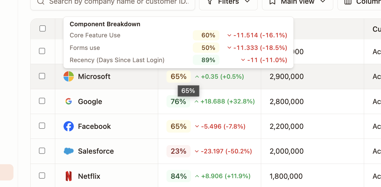
- Hover over a score to see the component breakdown in a tooltip.
- If scores don’t match your expectations, adjust thresholds or weights and recalculate.
Delta Tracking
You can optionally track how scores change over time by configuring delta periods (e.g. 7, 14, 30, 60, or 90 days). When enabled, Strand stores:
- Absolute delta — the change in score over the period (e.g. +5 points).
- Percentage delta — the relative change (e.g. +8%).
Deltas apply to both the final Health Score and each individual component score, making it easy to see whether an account is trending up or down.
Where Health Scores Appear
- Accounts table — as a color-coded column (red below 33, yellow 33-67, green above 67).
- Account detail — in the account’s data fields.
- Tooltips — hovering a Health Score cell shows the component breakdown with individual scores.
- Delta indicators — when delta tracking is enabled, changes over time are shown alongside scores.
Tips
- Start with 2-3 components and add more once you’re confident in the scoring.
- Use the Test feature before saving — it previews how a sample account would score, helping you calibrate thresholds.
- Linear mode works best for most cases — flat mode is mainly useful when you want a hard pass/fail within a band.
- Re-run Sync History after adjusting thresholds to recalculate historical data points.
- Components with null source values are skipped, not scored as zero. Accounts with partial data still get a meaningful score from the components that do have data.
Related
- Signals — use a dropping Health Score as a trigger for risk alerts.
- Recurring Tasks — automate review of accounts whose scores change.